

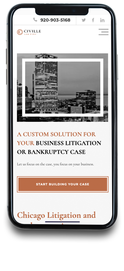
Your law firm’s website is more than just an online brochure. It’s often the first point of contact with potential clients. And increasingly, that first contact is happening on a smartphone or tablet. If your website isn’t designed with mobile users in mind, you’re not just missing out on potential business. You’re actively pushing it away.
This isn’t just about having a website that can be viewed on a mobile device. It’s about having a mobile-first website. But what exactly does that mean, and why is it so crucial for law firms in particular? At Civille, we specialize in creating websites that work seamlessly across all devices, and we’re here to explain the importance of a mobile-first approach.
Beyond “Mobile-Friendly”: Understanding Mobile-First Design
You’ve probably heard the term “mobile-friendly,” and you might even think your current website fits the bill. But “mobile-friendly” is often a bare minimum. It typically means a website designed primarily for desktop computers that has been adapted to also display on smaller screens. The layout might shrink, text might become smaller, and navigation might become a bit clunky. It’s usable on mobile, but it’s not optimized for mobile.
Mobile-first design, on the other hand, flips the script. It starts with the mobile experience as the primary focus. The design, layout, content, and functionality are all crafted with the smaller screen and touch-based interaction in mind. The desktop version then evolves from this mobile foundation, rather than the other way around.
Think of it this way: “mobile-friendly” is like squeezing a large painting into a small frame – it technically fits, but it loses its impact. Mobile-first is like creating a piece of art specifically for that small frame, ensuring every detail is perfect.
Why is Mobile-First Crucial for Law Firms?
The reasons for prioritizing mobile-first design are compelling for any business, but they’re particularly crucial for law firms:
- Client Expectations: People are searching for legal help on their phones. Whether it’s a quick Google search during a commute or an urgent late-night inquiry, potential clients expect to find what they need, quickly and easily, on their mobile devices. If your website is slow, clunky, or difficult to navigate on a phone, they’ll simply move on to a competitor.
- Google’s Mobile-First Indexing: Google prioritizes the mobile version of a website for indexing and ranking. This means that if your website isn’t mobile-first, your search engine rankings will suffer, making it harder for potential clients to find you. Google has been using mobile-first indexing since 2019.
- Local Search Dominance: Many legal searches are local – people looking for a lawyer “near me.” Local searches are overwhelmingly performed on mobile devices. A mobile-first website, combined with a strong local SEO strategy, is essential for capturing this local traffic.
- User Experience and Conversions: A positive user experience is critical for converting website visitors into clients. A mobile-first website provides a seamless, intuitive experience that keeps users engaged and encourages them to take action, whether it’s filling out a contact form, calling your office, or scheduling a consultation.
- Accessibility: A well-designed mobile-first website is often more accessible to users with disabilities, ensuring that everyone can access your services.
Read More: Why Would a Law Firm Not Have a Website?
Key Elements of a Mobile-First Law Firm Website
So, what does a mobile-first law firm website actually look like? Here are some key elements:
- Responsive Design: This is the foundation of mobile-first. A responsive website automatically adapts its layout and content to fit any screen size, from smartphones to tablets to large desktop monitors.
- Fast Loading Speed: Mobile users are notoriously impatient. Your website needs to load quickly, ideally within a few seconds. This requires optimizing images, minimizing code, and leveraging browser caching. Page speed is also a ranking factor on Google.
- Simplified Navigation: Mobile navigation should be intuitive and easy to use with a touch interface. Think clear menus, large tap targets, and a logical site structure.
- Mobile-Optimized Content: Content should be concise, readable, and easy to scan on a small screen. Use short paragraphs, headings, bullet points, and plenty of white space.
- Touch-Friendly Buttons and Forms: Buttons and forms should be large enough to tap easily with a finger and designed for mobile input.
- Click-to-Call Functionality: Make it easy for mobile users to call your office directly from your website with a prominent click-to-call button.
- Local SEO Integration: Ensure your website includes your firm’s name, address, and phone number (NAP) in a consistent format, and integrate with your Google Business Profile.
- Prioritize Key Information: Mobile users have limited screen space. Be sure that you place your most important information at the top, where it is easier to find.
The Civille Approach to Mobile-First Design
At Civille, we don’t just build websites; we build mobile-first websites designed to attract, engage, and convert potential clients. We understand that the mobile experience is paramount, and we prioritize it from the very beginning of the design process.
Here’s how we approach mobile-first design for law firms:
- Mobile-First Planning: We start by understanding your target audience and their mobile usage habits. We then plan the website’s structure, navigation, and content with the mobile experience in mind.
- Responsive Design Expertise: Our team is skilled in creating responsive designs that look and function flawlessly on all devices.
- Speed Optimization: We optimize every aspect of your website for speed, ensuring fast loading times on mobile networks.
- User-Focused Design: We prioritize user experience, creating intuitive navigation, clear calls to action, and mobile-friendly forms.
- Ongoing Testing and Optimization: We continuously test and refine your website’s mobile performance to ensure it’s meeting the needs of your clients and achieving your business goals.
Go Mobile First With Civille
Investing in a mobile-first website is an investment in the future of your law firm. It’s about ensuring you’re visible where your clients are searching, providing a user experience that builds trust, and ultimately, driving growth for your practice.
Civille is committed to helping law firms build long-term success in the mobile-first world. We’ll work with you to create a website that not only meets today’s demands but also adapts to the evolving needs of your clients and the ever-changing digital landscape. Contact us to start building your mobile-first future.