More Cases.
Less Guesswork.
Just For Law Firms.
Smarter tech with real strategists. Everything your firm needs to grow in one platform.
Real Results for Real Law Firms
We don’t just build — we grow. Our clients consistently see major increases in traffic, leads, and revenue.
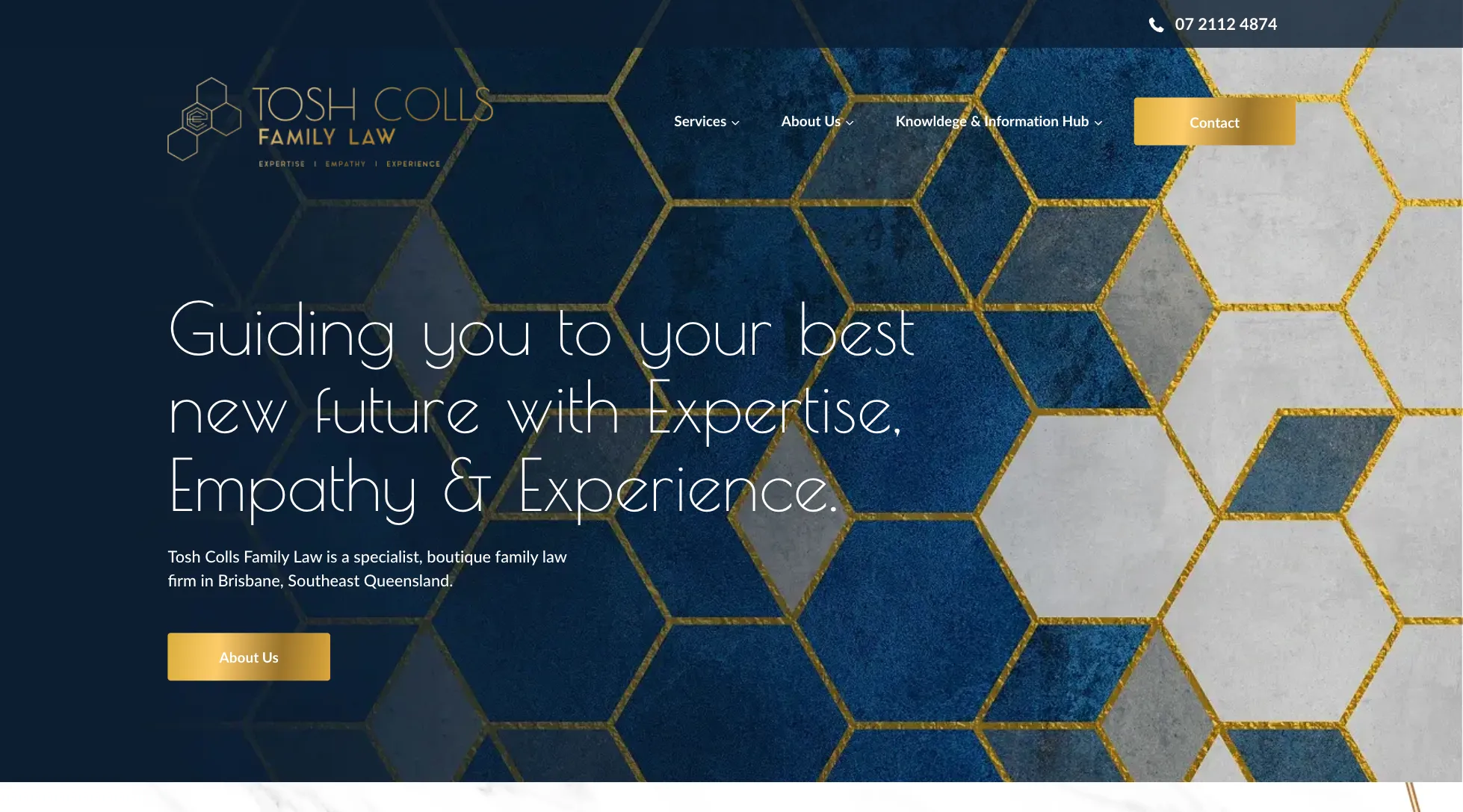
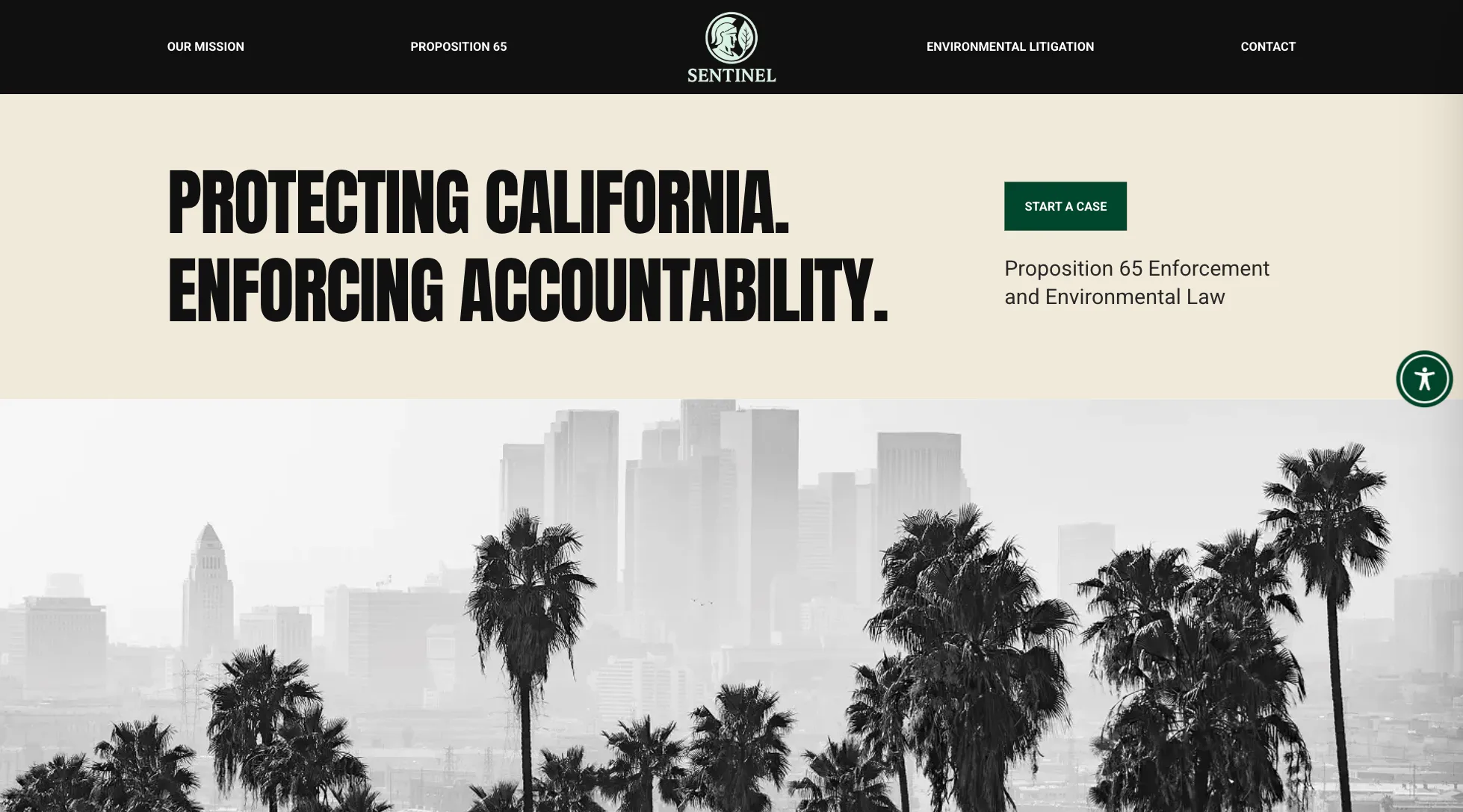
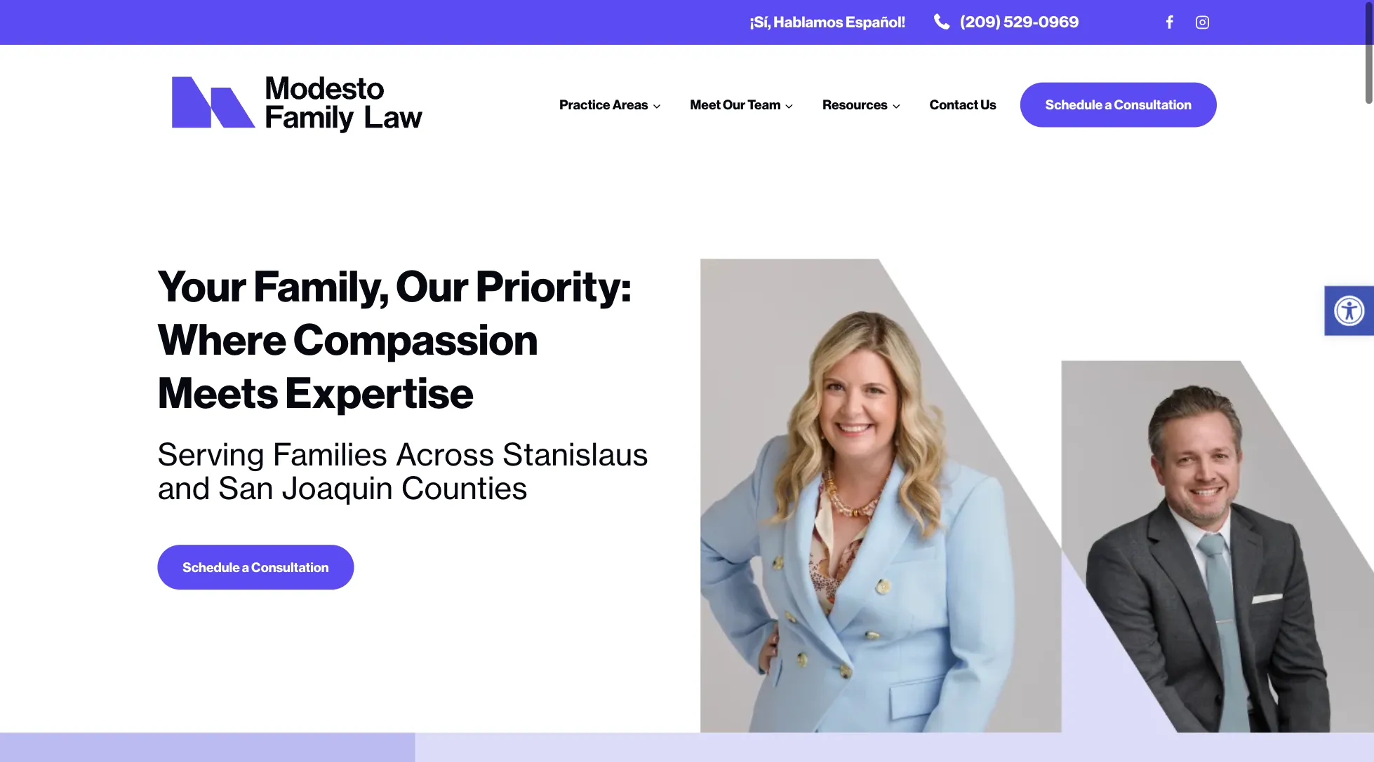
See Our Latest Launches
We design and launch beautiful, fast, SEO-ready sites every month.


Services and Tools That Drive Results
From full-service marketing to plug-and-play tools, Civille offers everything a law firm needs to grow online and convert leads. Explore our most popular offerings below.
-

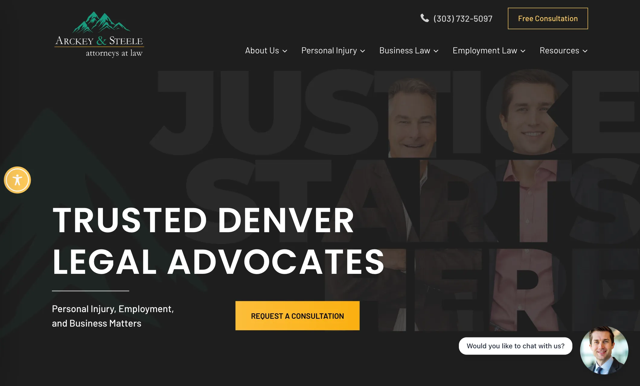
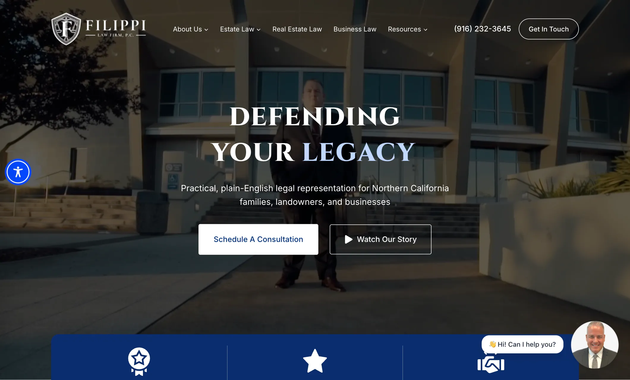
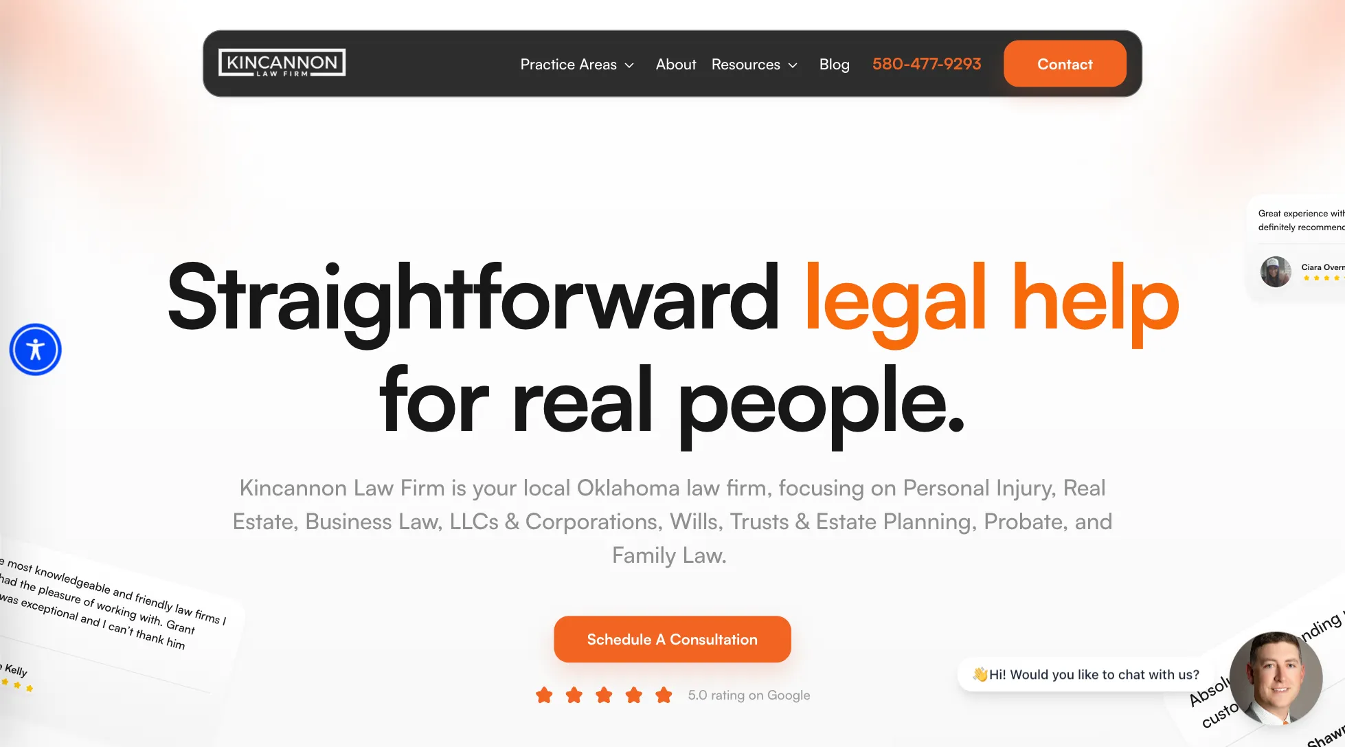
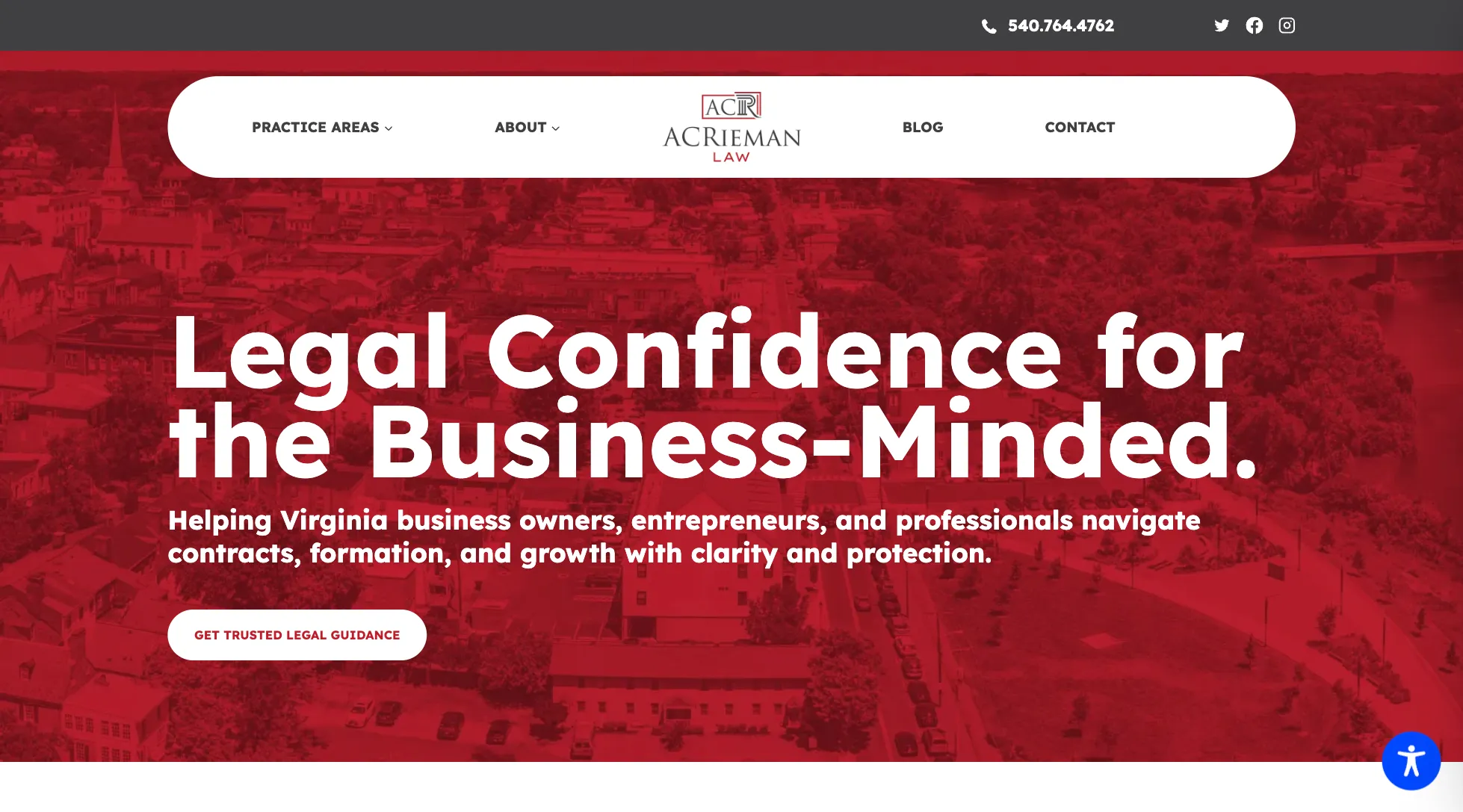
Website Design
Websites that are modern, fast, mobile-friendly, and built just for law firms and their clients.
-
SEO
Dominating intent-based search results to ensure your firm is found when it matters most.
-
GBP Optimization
Strategic management of your Google Business Profile to capture high-value local “Map Pack” traffic.
-
PPC
High-precision PPC management that prioritizes your bottom line by targeting high-intent cases and filtering out the junk traffic that inflates your costs


-
Law Forms
We replace long and scary forms with guided decision trees that make complicated intake easier to understand by breaking it down into small, easy-to-follow steps.
-
Civille Chat
Millennials are 20% more likely to use chat over forms. 75% of younger prospects prefer messaging over phone calls. A “call-only” strategy ignores the largest segment of the legal market.
-
Scheduler
The Civille Scheduler makes your website a 24/7 booking engine, so potential clients can book appointments online and get an instant spot on your calendar.
-
Counsel AI
Get leads, qualify them, and turn them into customers while your team sleeps. Counsel AI is trained to know your practice and sort through cases to find the best ones.


Built by People Who Get It
Behind every site and every strategy is a real person who understands the legal space.
-

Wes Lungwitz
Managing Partner /
Co-Founder -
Eric Giroux
VP of Strategy
-
Calvin Krusick
Director of Product
-
Clint Monette
Director of Search
-
Paul Cashman
Director of Business
Development -
Bowen Hobbs
Creative Director
-
Kate Winninghoff
Digital Marketing
Coordinator -
TAYLOR SLEGER
Account Manager
-
ERIC ENDRES
Account Manager
-
Logan Verboomen
Client Success
Associate -
Darya Simakova
Client Support
Specialist -
Jordan Miller
Account Manager


Marketing agencies love to talk about their “team.” Ours is the reason clients stay. Search strategists, account managers, designers, developers, and support specialists who’ve spent their careers in legal marketing and know what actually moves a firm. When you work with Civille, you’re not handed off to whoever’s free. You get people who understand your practice and answer when you call.
Built to Work With the Tools You Use
Civille integrates with top legal platforms to keep your workflow seamless.


How Does Your Website Stack Up?
Get an instant assessment of your site’s visibility, speed, and SEO performance — and see where there’s room to grow.
SEO and GBP Wins Across the Board
We’ve helped 100+ firms rank higher, convert faster, and grow smarter.
-

Everyone at Civille is efficient, prompt, and transparent. The services they provide are excellent, and we could not be happier!
-
We’ve been extremely happy with Civille. From start to finish, their service has been top-notch. They’re always incredibly responsive and ready to help with any request, no matter how big or small. The outcome of their work has exceeded expectations. Highly recommend their services!
-
As the Marketing Coordinator for the Law Office of Sandy McCorquodale, P.C., I couldn’t be more impressed with the outstanding service provided by Civille. Their team demonstrated exceptional attentiveness and truly understood our vision for our website. They’ve been incredibly responsive, promptly addressing any edit requests with efficiency and care. The overall experience has been excellent, and we are excited to continue building a strong relationship with Civille. Highly recommend their services!
-
Excellent service. Highly recommend for any busy law firm that relies on metrics.
-
I highly recommend Civille for website and marketing services! Their team is professional, knowledgeable, and truly understands how to elevate a business’s online presence. They delivered a stunning, user-friendly website and implemented effective marketing strategies that boosted our visibility and client engagement. Exceptional service and results!
-
Excellent service from Paul and his team. I worked with Jacob who helped every step of the way with the foundation of my logo and website. High attention to detail and a top notch customer experience!! Thank you!
-
The team at Civille is passionate about their work, provide excellent service, and a great product!
-
Civille had our website redesign up and running within the 30-day timeline as promised. We had been with another vendor for nearly two decades and had not noticed the stale content, lack of innovative functionality, and errors our site contained. Civille addressed all these issues and provided a website of which we are proud.
Another plus working with Civille is the quality of the staff. They have a talented team, and any issues that arise are immediately addressed. We have been fortunate to work closely with Jacob and Wes and because of them the transition to the new site was painless. Plus, the reports provided on a regular basis really help us understand how our site is being used.
-
Civille is very professional and they achieve results.
Free Legal Marketing Guides
We’re more than a website vendor — we’re educators. Download our latest legal marketing guides and stay ahead of industry trends.
-

How to Get Your Law Firm Cited in AI
When someone asks ChatGPT or Google’s AI to recommend a lawyer, is your firm in the answer? This guidebook explains how AI tools decide which firms to cite, what signals they pull from your website and reviews, and the concrete steps that improve your odds of showing up. This is where search is heading, and early movers have the advantage. -

How to Use AI for Your Law Firm’s SEO
AI is changing how law firms show up in search, and most firms haven’t caught up. This guidebook breaks down where AI actually helps your SEO, where it hurts, and how to use it without publishing content Google penalizes. You’ll get practical steps you can hand to whoever manages your website, plus the mistakes we see firms make most often. -
Solo Law Firm Digital Marketing Playbook
Running a solo practice means marketing gets whatever time is left over, which usually isn’t much. This playbook is built for that reality. It covers where solo attorneys should focus first, what to skip entirely, and how to compete against bigger firms without their budgets. Every recommendation accounts for the fact that you’re the attorney, the owner, and the marketer. -
How to Optimize Your Law Firm’s Google Business Profile
Your Google Business Profile drives more calls than most pages on your website, yet most firms set it up once and never touch it again. This guidebook walks through the settings, categories, photos, and review strategies that move your firm up in local map results. Everything here is specific to law firms, and you can knock most of it out in an afternoon. -
How to Improve Your Law Firm’s Page Speed
Slow websites lose cases. Potential clients leave before your homepage loads, and Google ranks you lower because of it. This guidebook explains what actually slows down law firm websites, how to test your own site in minutes, and which fixes matter most. No developer background needed. We’ll show you what to check and what to ask your web team to fix. -
How To Bring in More Quality Law Firm Leads
More leads doesn’t help if half of them aren’t cases you’d take. This guidebook covers how to attract the right clients for your practice areas, qualify them before they ever reach your intake team, and stop wasting time on calls that go nowhere. You’ll learn what’s working right now for firms your size, from website changes to follow-up timing. -
How To Boost Your Law Firm’s SEO
Ranking on Google isn’t luck, and it isn’t something only big firms with big budgets can do. This guidebook covers the fundamentals that actually move law firm rankings: practice area pages, local signals, reviews, and content that answers what potential clients search. Skip the theory. These are the same steps we use with our own clients, laid out in plain terms.