In October of 2020, Lincoln Labs had identified a fit for its first Lab: websites and digital marketing for the legal space. All we needed was a name, a color scheme, fonts, a website, a name…
A Brand By Any Other Name
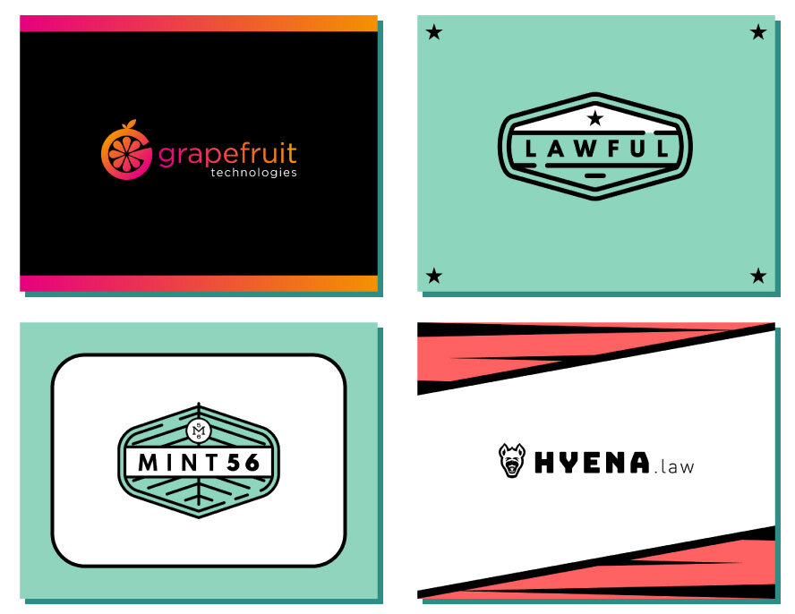
Our first step in the creation of this new Lab was to find a name for it. We considered 13 different names ranging from Grapefruit to Hyena to Mint56, eventually landing on Civille. We decided to pair the new name with a Liberty green, white, and black color scheme.
Next Stop: The Logo
There were specific ideas and values we wanted to convey within the Civille brand. We wanted Civille to be idealistic and uplifting but still serious in nature. We also set out to develop a responsive logo system instead of a singular logo for all applications. After setting the goal and the parameters, we got to work. We started with a tall, bold CIVILLE wordmark containing a torch icon as a nod to our previous venture and a symbol of our enduring promise to help lawyers connect with the people who need them. We housed the wordmark inside a Liberty green talk bubble as a symbol of communication. Lastly, we implemented a 5º upward angle throughout the mark for the uplifting and idealistic values we uphold.
Read More: Logo Design for Law Firms
A Picture Says a Thousand Words
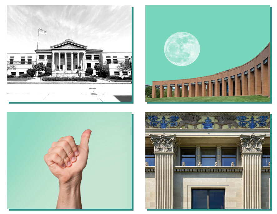
A brand’s visuals set the tone for its message. With Civille, we wanted to keep our aesthetic relatively light in order to maintain the idealistic and uplifting ideals we strive for. To that end, we avoid dark imagery, with our photos and backgrounds typically rendered in Liberty green, white, or full color. Additionally, we try to avoid stock images when possible, leaning on local photography of Oshkosh, WI’s classical architecture.
Make It Iconic
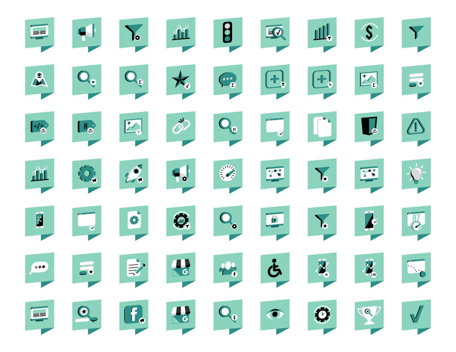
Another way in which Civille has strayed from stock imagery is with its proprietary icon set. The icons all mimic the structure of the icon mark in the responsive logo set, just swapping out the Civille C for whichever icon best suits the idea.
Love at First Site
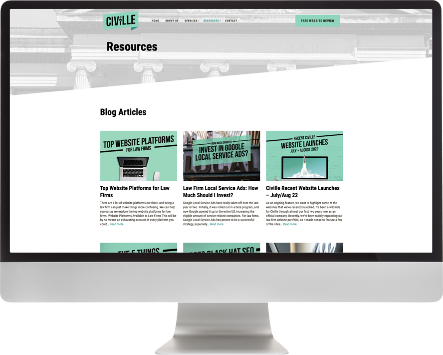
The Civille website not only showcases our product offerings but acts as a hub of knowledge for lawyers and firms to expand their digital footprint, boost their search rankings, and bring in more leads. We offer information in a variety of formats, from case studies to whitepapers to blogs. Why would we give this useful information away for free? Because we meant it when we said our goal is to connect the right attorneys with the right clients. Our brand is more than a logo and a color scheme. It’s an ideal we work toward every day.
Build Trust in your Law Firm through Site Design
Our Social Responsibility
Our social feeds mirror the rest of our marketing materials with its optimism and idealism. In addition to posts sharing some of the weirder laws this country has to offer, we also use our social feeds to share information about our blog and which industry shows we attend. The format is looser than most of our collateral, which gives us a chance to share more current things that aren’t on the website.
Closing Argument
Building the Civille brand included the obvious steps of logo design, choosing a colorway, and developing the supporting collateral like the website, icons, and social media graphics. But the real value of the Civille brand is the promise it represents. And at Civille, we strive to fulfill that promise every day.
