Design + Branding / By Bowen Hobbs
A logo’s job is to communicate your brand, whether you’re selling shoes, French fries, or legal services. Great logos become symbols for a brand’s promise, sometimes to the point where the name can be removed due to the symbol’s ubiquity. How does this relate to law firms? While most law firm logos will never reach wordless icon status like Apple or Nike, a good logo can lead potential clients to place more trust in your firm.
Keep It Simple, Surely
There’s a reason the best logos aren’t complicated: it’s because they have to be an identifying mark with a unified presentation across all channels. What does that mean? It means that your law firm logo should be readable at small sizes and impactful at large sizes. It also means that it will sometimes need to function with a limited color palette. Your logo will be used as a website header, a social media icon, a letterhead masthead, in advertising, on printed swag, and on signage. With all those variables to account for, it’s no surprise that a simple mark will oftentimes be more effective.
Start with Black-and-White
A good icon will be just as striking in black-and-white as it is in color. In addition, a black-and-white mark will usually be your go-to art file if and when you print pens, coffee mugs, or even t-shirts, as the price of these printing methods is usually determined by the number of colors printed. You can’t save a poor logo design by adding color, but a good mark will function regardless of color palette.
The Size of a Dime
Seeing a law firm logo in a larger-than-life setting can be stunning, but is that the most important setting? Often it isn’t. Even if you’re in a large metropolitan area, only so many people will drive by your building or billboard, and chances are they are looking at one of the other signs in the area or the other vehicles on the road. While those high-traffic areas are valuable, the internet contains traffic from all around the world, allowing your brand to reach further than ever. Add in social media, and millions could see your law firm’s logo. A logo design that is simple enough to be read clearly on a website header or as a social media avatar, which is even smaller than a dime on most phones, is crucial to potential clients being able to identify your firm. Simple logos are also easier for viewers to recall and describe to others.
Know Your Competition
We’ve all seen them: the law firm logo with a column or the Scales of Justice. Sure, those symbols scream “Lawyer!” at first glance, but they’re also so widely used that it’s difficult to tell one from the other. One of the goals of branding is to stand out from the masses.
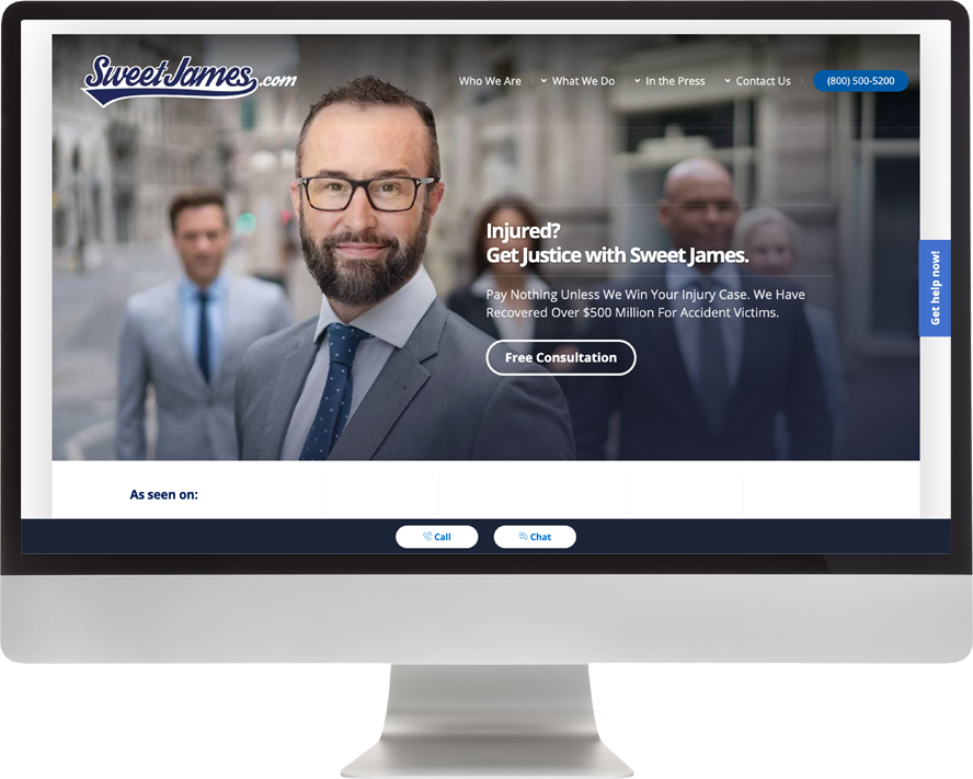
For example, I used to live in the Los Angeles area, and one law firm I will never forget is named “Sweet James”. He’s an LA-based injury lawyer with a brand that bucks almost every trend in the legal space. You won’t find any serifed fonts or Scales of Justice icons in his branding. Instead, what you will see is a baseball-style script spelling out Sweet James, which perfectly matches his website URL (sweetjames.com). While the script itself is imperfect, it communicates the brand in a memorable and unexpected way that catches viewers’ attention. I’ve seen countless law firm billboards, but I remember Sweet James.
Is Your Law Firm Logo Responsive?
By now, you’ve probably heard of responsive websites which recognize the device you are using and serve you a version of a website optimized for the screen size of that device. But what is a responsive law firm logo? It’s really more of a logo system, with a handful of marks optimized to communicate the same identity at a variety of sizes and aspect ratios.
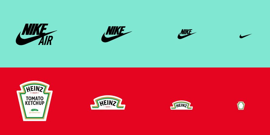
Why is this important? Because of all the places your law firm’s logo will live. Need to use your logo on social media as a profile pic? Awesome! Use the icon version that is designed to read at small sizes, especially because your name will appear alongside it. Need a version of your logo for your website? Great! A horizontal lockup of an icon and your firm’s name fits that space perfectly. Need your logo to appear on swag? If it’s a t-shirt or coffee mug, you can probably use the full version of your logo, but if you’re putting it on a pen, the aforementioned horizontal logo lockup might be ideal. Here is an example of a responsive logo system we created for a Wisconsin-based Estate Planning attorney, Giff Collins:

And remember, it’s extremely rare to see a logo in isolation. Don’t forget to consider how your logo looks within the context of business cards, advertising, your website, and any other venue in which you might use it. While it may be tempting to go on Fiverr and get a logo at a low cost, the truth is you often get what you pay for. Hiring a professional designer (or Civille) to consider your firm’s design needs will usually yield the best results.