
For most websites, law firm websites included, your homepage is going to be your most visited page. This is where people will land when they are in need or even just curious. Your homepage will be the intro to who your firm is, what you are capable of, and what working with you is going to be like. This means that for many of your clients, your first impression is happening before you ever meet them.
If we take a look at the anatomy of a high-performing law firm homepage, we will find a few things in common with all of them. At Civille, we’ve built our fair share of law firm websites (and more!), and there are a few things that every high-performing law firm homepage should have.
Lightning Speed for Lasting Impressions
In the digital world, patience is a virtue few possess, especially when seeking legal help. Speed isn’t just a technical detail or a minor Google ranking factor. It’s a fundamental aspect of the user experience and a powerful first signal your firm sends.
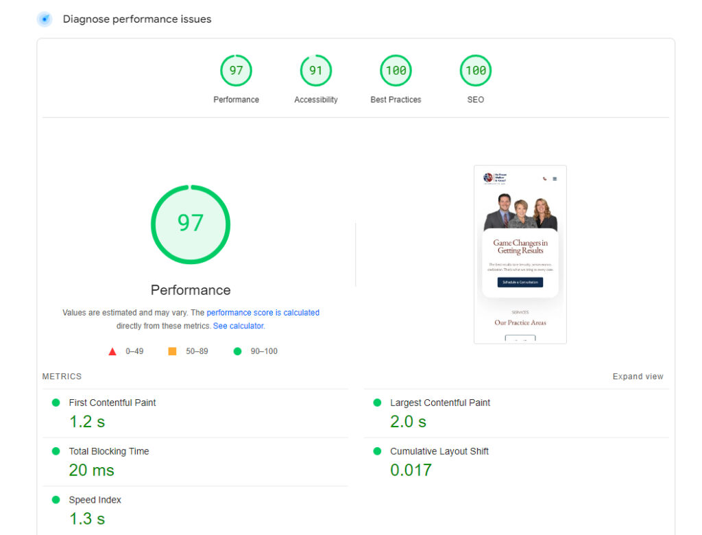
A slow-loading homepage is often frustrating for visitors. They might think, “If their website is clunky and behind the times, what will working with the firm itself be like?” This initial perception can lead them to click away before they even see what you offer. Prioritizing a fast homepage, something we obsess over at Civille, shows respect for your visitors’ time and projects an image of efficiency and professionalism from the very first click.
Thinking Mobile From the Start
Picture this: someone needs a lawyer, and like most folks these days, they grab their phone first. Whether they’re on the go, at home, or in a bit of a panic, that tiny screen is often their first encounter with your firm.
So, what’s “mobile-first” really all about? It simply means your website’s homepage is designed from the ground up to look and work great on a smartphone. Instead of building a big desktop site and then hoping it squishes down okay, you plan for that mobile view right from the start with easy-to-tap buttons, clear text, and fast loading. Only after the mobile version is perfect do you then adapt it for larger desktop screens.
This way, you ensure everything from how quickly the page pops up to how easy it is to find your number feels right on a phone. If using your site on mobile is a struggle, potential clients are gone in a flash, often before you even knew they were there. And it’s not just about keeping visitors happy. Google itself uses your mobile site to decide how to rank you, so a great mobile experience is a win-win.
10 Ways to Improve Law Firm Website Page Speed
Guiding Your Visitors with Clear Navigation
Just as you want your visitor to have an easy time getting to your site in the first place, you also want them to be able to find any resources they may need quickly. This requires intuitive and clear navigation.
Your main menu should clearly list your key practice areas, provide access to attorney bios, and have an obvious link to your contact page. Vague or overly clever labels can cause confusion. Ensure your navigation works seamlessly and is easily accessible on all devices, from desktops to phones. A bad navigation experience is just another way to lose a potential client.
Captivating Content That Speaks to Needs
The content on your homepage, especially what appears “above the fold” (the part of the page visible without scrolling), is your prime opportunity to connect. Having a strong message here is vital. This is typically your main headline and a brief supporting statement or value proposition. This is your chance to immediately address a potential client’s pain point, showcase your unique strength, and entice people to learn more, keep scrolling, or even navigate to a specific practice area page.
But that’s not where your homepage content ends. The rest of the page needs to reinforce this message and provide further reasons to choose your firm. Ensure that your content on your homepage is well-laid out, digestible, and full of everything that a potential client wants to hear. This means:
- Clear, concise language: Avoid dense legal jargon. Speak directly to your potential clients’ concerns.
- Focus on benefits, not just features: Explain how your firm will help them achieve their desired outcome.
- Empathy and understanding: Acknowledge the challenges they might be facing.
- Strategic calls to action: Guide them towards the next step you want them to take.
Keep it Current: Showing Off Your Latest Blog Insights
If you’re putting in the effort to write blog posts, sharing your knowledge, and keeping up with legal developments, don’t hide that good work! Your homepage is a perfect spot to show off a few of your most recent articles. When a potential client sees fresh, relevant blog titles, it tells them your firm is active, engaged, and on top of what’s happening right now in your field. It gives repeat visitors something new to check out, too. Giving those new posts a spotlight on your homepage helps Google find them faster and see them as important, which can give them some help in search rankings.
Read More: Will AI Replace Search?… And How Could it Affect Your Firm

Put Your Reviews and Testimonials to Work
When someone’s looking for a lawyer, especially for a serious matter, they’re looking for reasons to trust you. Your homepage is the perfect place to offer that reassurance by showing them what others think and what you’ve achieved. We’re talking about highlighting those glowing reviews people have left, perhaps featuring a particularly well-written testimonial that tells a story, or, if it fits your practice area (and ethical rules allow), sharing some of your significant case wins. These aren’t just vanity metrics. They’re real-world proof that you know your stuff and can get results. For someone facing a tough legal battle, seeing these examples of your firm’s competence and past successes can make all the difference in them feeling confident enough to pick up the phone.
The Responsibility of Fresh Social Proof
With showcasing reviews and wins comes a crucial responsibility: keeping them current. If you are going to post reviews, case wins, and similar trust signals, you are going to want to update them as often as possible. You might consider feeding in your good reviews automatically from platforms like Google Business Profile (though it’s wise to audit them frequently in the process to ensure only appropriate ones are displayed).
Crucially, make sure your latest wins or key testimonials are always prominently featured. If you have a long gap between your last highlighted review/win and the current date, a potential client may see that as a drawback instead of a big plus, wondering if your success is a thing of the past. Freshness signals ongoing competence and activity.
Always Within Reach Essential Contact Information
When a potential client decides they want to reach out, the process needs to be effortless. Make sure your contact info is always within reach for any visitor, no matter where they are on your homepage. A common best practice is to have your phone number (ideally clickable on mobile) or a contact icon pinned in the main navigation bar so it’s always visible. Then, repeat this information clearly in the website footer, along with your physical address and any other relevant contact methods like a general email address. Don’t make them hunt for it.
Making Contact Easier with Homepage Forms
While a “Contact Us” page is standard, bringing a contact option directly onto the homepage can significantly increase inquiries. Forms are a great contact method. They are very trackable (allowing you to see exactly where leads are coming from), sometimes preferred by clients who may not want to call immediately or are Browse after hours, and with small form factors, they can fit in a variety of places without being obtrusive. Civille’s multi-step forms, for example, are designed to be less intimidating and can improve lead quality by breaking down information requests. While it’s a good idea to have them on your practice area pages and especially your contact us page, you can and often should put a concise contact form directly on your homepage too, often towards the bottom or in a clearly defined section.
The Unseen Foundation Homepage Technical SEO
While content and design are what visitors see, what search engines see “under the hood” is also critical for your homepage’s performance. Technical SEO for your homepage involves ensuring it’s properly optimized for search engines to understand and rank.
This includes a well-crafted meta title and meta description that accurately summarize your firm and its key offerings, a clear H1 heading that states your main value proposition, and potentially implementing organizational or local business schema markup to give Google more explicit information about your firm. A fast, secure, and mobile-friendly structure, as discussed earlier, is also a huge part of technical SEO.
Read More: SEO Basics for Attorneys
Design The Thread That Ties It All Together
It may seem strange that we’ve placed design towards the end, but design is the thing that connects all of these ideas together to make a homepage work. Good design isn’t just about looking pretty either. It’s about functionality, user experience, and trust-building. Some key design principles for a high-performing law firm homepage include:

- Professionalism and Trust: The design should immediately convey competence and reliability.
- Brand Consistency: Use strong colors that play off any existing logo or brand colors you may have, and maintain consistency in fonts and imagery with your overall firm branding.
- Readability: Ensure text is easy to read against any backgrounds you may be using and that it’s big enough, regardless of the screen it’s being viewed on.
- Visual Hierarchy: Guide visitors’ eyes to the most important elements (like your value proposition and calls to action) using size, color, and placement.
- High-Quality Imagery: Use professional photos of your team and office, or relevant, high-quality stock imagery if custom photography isn’t feasible. Avoid generic or cheesy stock photos.
- Clear Calls to Action: Design buttons and links that are clearly identifiable and encourage clicks.
Effective design pulls all the other elements, speed, navigation, content, contact points, etc. into a cohesive and persuasive experience that converts visitors into clients.
Get a High-Performing Law Firm Homepage From Civille
At Civille, we apply these principles to every website we build to provide the best possible site we can for every law firm. We can help you find online success while building your digital rankings, increasing lead quality, and giving you a website that you can be proud of. Reach out to Civille today and let us get to work designing your dream law firm website.