When it comes to websites, much of the focus is placed on performance, for good reason. Performance helps you rank on Google, which helps more prospective customers find you. More people on your site will usually convert into more business. But what happens when you have plenty of inbound traffic but conversions are trailing behind? Could the site design be keeping visitors from fully trusting your abilities? Let’s take a look at a few simple strategies for grabbing visitors’ attention and imparting a sense of trust in the process.
Your Brand Should Be You
You are the heart of your brand. And it should be that way. The name on the business is yours (or your creation). The logo, color scheme, and slogans you use are an extension of you, as you likely had to approve their use. Your website is no different. It’s a window for potential clients to know who you are and what you can do for them. Whatever your special sauce consists of, there’s a way to show it off. If you tout your extensive experience, your website should say it. If your top skill is your ability to make people feel at ease, your website messaging and imagery should say that. At the end of the day, your website needs to represent your personality because that’s what people are buying.
Color Schemes Convey More Than You’d Expect
Want to show people your firm is rooted in years of experience? Use a traditional color palette of jewel tones and metallic hues to demonstrate a timeless aire. Are you bright and confident? Lighten up your color scheme with a few pastel tints to keep things light and optimistic. Are you bold and not afraid to fight for your clients? Try a strong accent color against black-and-white imagery to show your determined, no-nonsense approach. People respond to colors both consciously and subconsciously. Make sure your color scheme reflects your personality because your visitors will make those assumptions, sometimes unintentionally.

Fonts Have a Ton of Personality
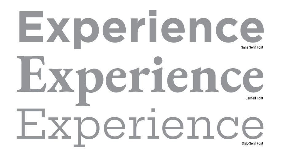
You may think you want to use a font you found across your entire site, but you have second thoughts when you see it in practice. Some fonts were never designed to be used across multiple paragraphs at small sizes and only work for headlines. As a general rule, serifed fonts (the fonts with “feet”) display a more traditional feel, while sans serif fonts give off a modern vibe. Want something friendly? Try a sans serif or slab-serif typeface with a tall x-height (the distance between the baseline of the letterforms and the top of a lowercase X). That taller x-height will create an open appearance throughout the letterforms’ negative space, making you look more open and cheerful.

Don’t Put Up Barriers
A lot of people want to add videos and widgets to their site, but at its simplest, a good website allows your visitors to access information about you and your firm with ease. Set aside the gimmicks that bloat your site and add unnecessary seconds to load time for a clean design that focuses on your personality and brand promise. Your customers will appreciate it.
Make Sure It Works on Mobile
More than half of website traffic comes from mobile devices. Make sure you are using a responsive site design that allows your brand to shine through whether it’s viewed on a phone, a tablet, or a desktop computer.
Lastly, remember that design isn’t the only thing that creates a brand. Every interaction you have with a potential client is a touchpoint that shows you off. If you’d like your site to show off your personality, let us know. We’re happy to help you be the best version of your online self you can be.


