It’s hard to start from scratch when it comes to something as important to your law firm as a website. You want to know who has built the best sites and what they look like. That’s why every year Civille puts together these comprehensive rankings of current law firm websites, and we try to break it down by practice area too. Here’s our 2024 edition of the 20 best personal injury law firm websites.
Civille’s 2024 Picks for Top Personal Injury Law Firm Websites
There are a lot of things that we look for in determining a top personal injury law firm website. First, it needs to look good and function well, but it also should have great SEO value. This means a website with content that is smartly written, strong SEO, and a fast page speed.
Of course, you will find a few Civille sites listed below but we also included many sites from other providers as well. Check out our top picks. If you find something you like, even from another provider, Civille can help you build it.
1. Richard D. Hobbs
Why We Like It
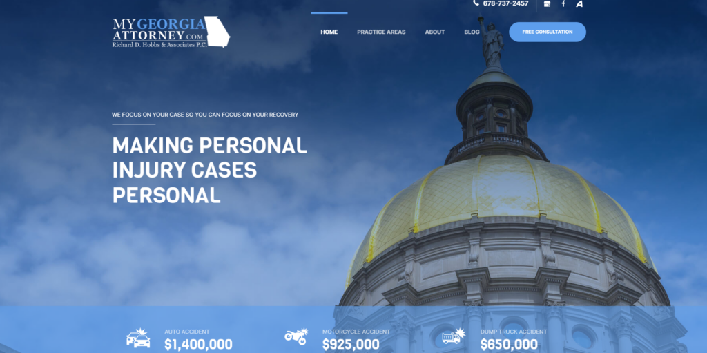
There is a lot to love about this site with its focus on Georgia in its branding and its URL to the imagery, design, color scheme, and more. The site is also lightning-fast, has a very active blog, and keeps things both simple and very informative.
2. AFJ Law Firm

Why We Like It
Simple is sometimes best, and when you can tie in your local area with a simple message you can make a big impact. That’s what AFJ does with a few snowy Montana mountains, their “Make Your Voice Heard” slogan, and a pop of color for a free consultation. Beyond that, they have a case wins slider, blogs, accolades, and more all without impacting the site speed on this fast site.
3. Alta Legal
Why We Like It
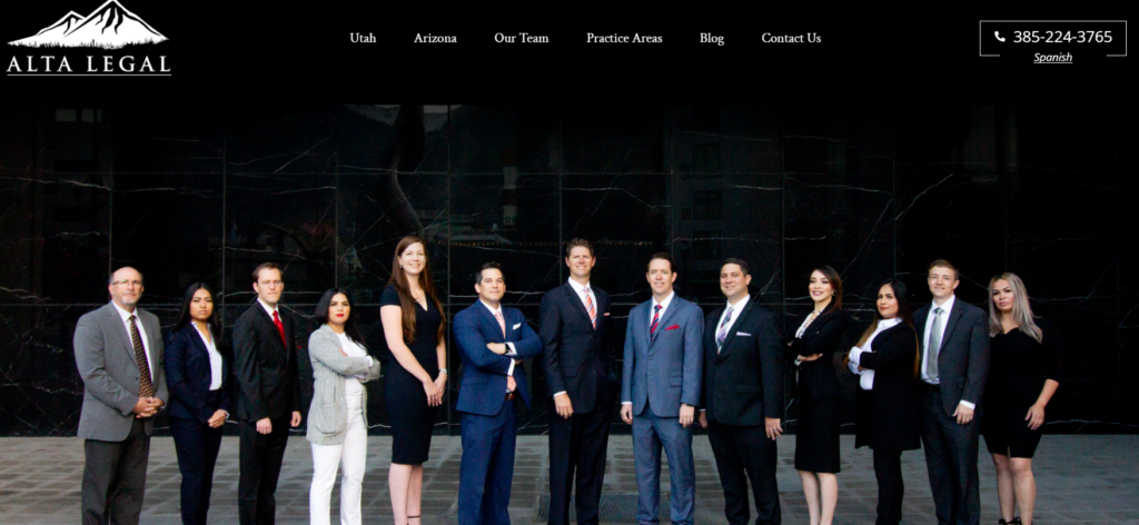
Alta Legal is a simple site. On the surface, it seems rather black and white, from logo to color scheme, but that allows the attorneys, the locations, and the practice areas to provide their own pops of color making it clear that they are the focus. It’s a clean site that does a lot of heavy lifting with very little.
4. Drake Hileman & Davis
Why We Like It
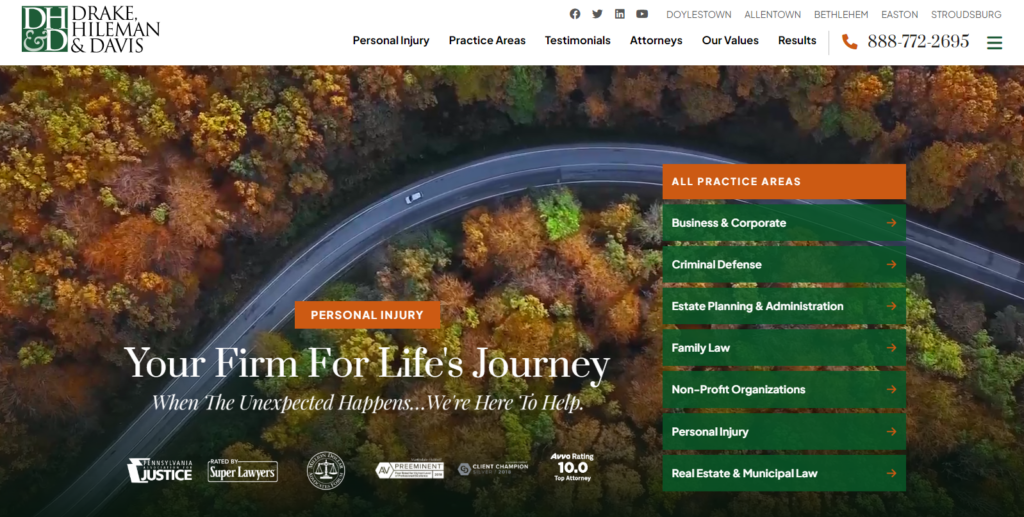
Green and orange are not immediately obvious branding colors for a law firm website, but they work here especially when combined with the imagery of a peaceful road in early fall. This law firm has a wide range of practice areas, but PI is still a major focus. They also have a unique double-tiered menu with their cities at the top and their normal menu items right below.
5. Steven Jones Injury Law
Why We Like It
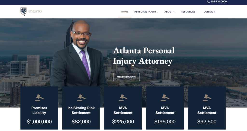
The Steven Jones website gets to the point with a simple menu, highlighted case wins, and the solo attorney Steven Jones front and center with the Atlanta skyline behind him. This site is fast, filled with information, and keeps a personal face on the brand.
6. Saperstein Law Group
Why We Like It
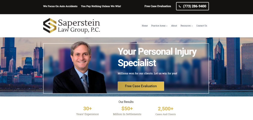
Saperstein manages to give that personal touch with an attorney profile image against the backdrop of the Chicago skyline. Combine that with accolades and a slick website design, and Saperstein stands out. They also focus specifically on auto and rideshare accidents to help themselves stand out in the competitive Chicago PI space.
7. Parris Law Firm
Why We Like It
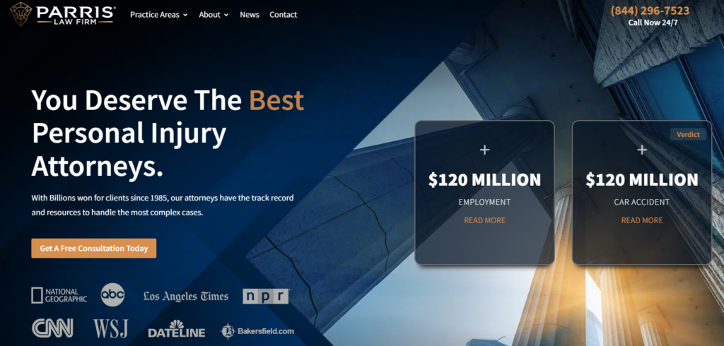
This site does a lot to put the best foot forward with a simple menu that puts the focus on their recent wins slider, the accolades, and their offer for a free consultation. Even with the simple menu, there is still a lot of info that is easily accessible on the site, including a regularly updated blog which is something that Civille recommends for many of our clients.
8. Weber Law Firm
Why We Like It
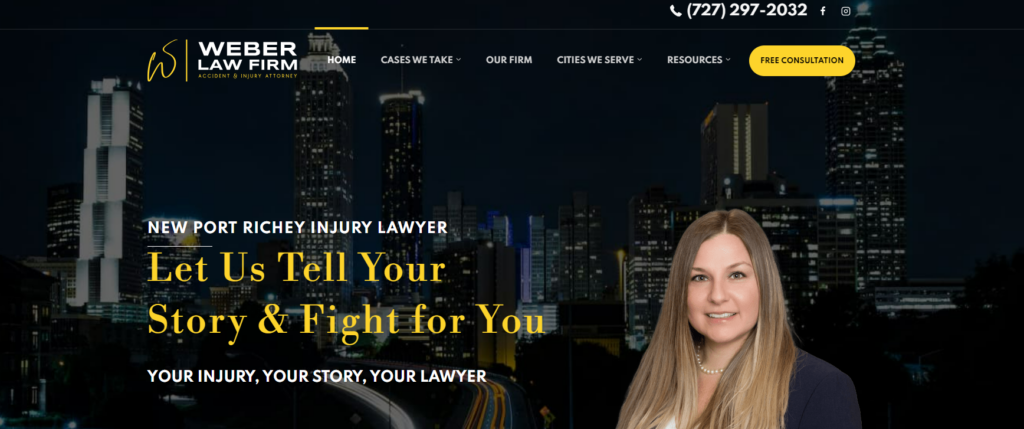
The color scheme adds a beautiful pop to this site with a headshot of Lauren N. Weber drawing focus right up top. The site also has a ton of great search engine-optimized content, local imagery, and a growing videos section.
9. Stracci Law Group
Why We Like It
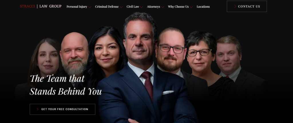
With strong imagery, a simple menu structure, and the use of animation, this site does stand out. However, it suffers from a low page speed score and an underutilized blog which prevents it from climbing further up this list.
10. The Louthian Firm
Why We Like It
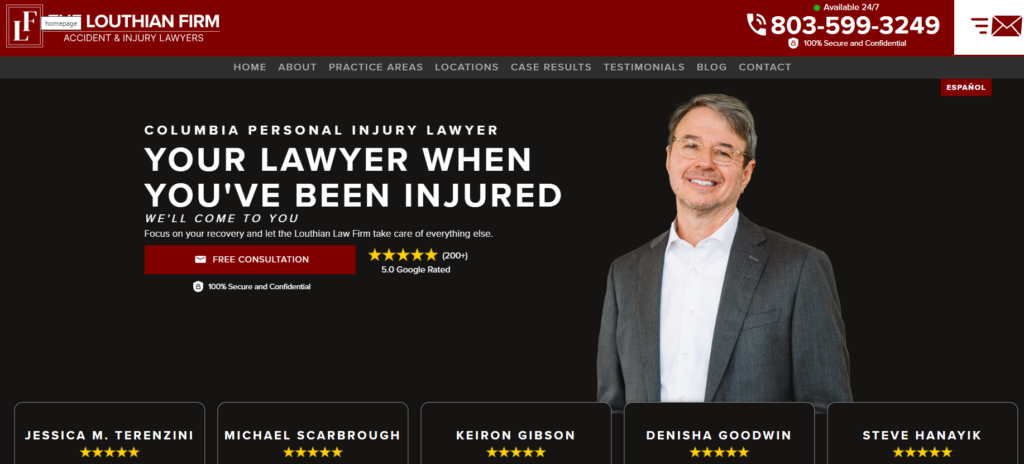
In personal injury, you either have to be huge or you have to have something that differentiates you. The Louthian Firm stands out as a small solo firm with a lot of 5-star reviews and it puts these two facts right out front with a featured image of the attorney and prominently featured 5-star reviews.
11. Hudson Injury Firm
Why We Like It
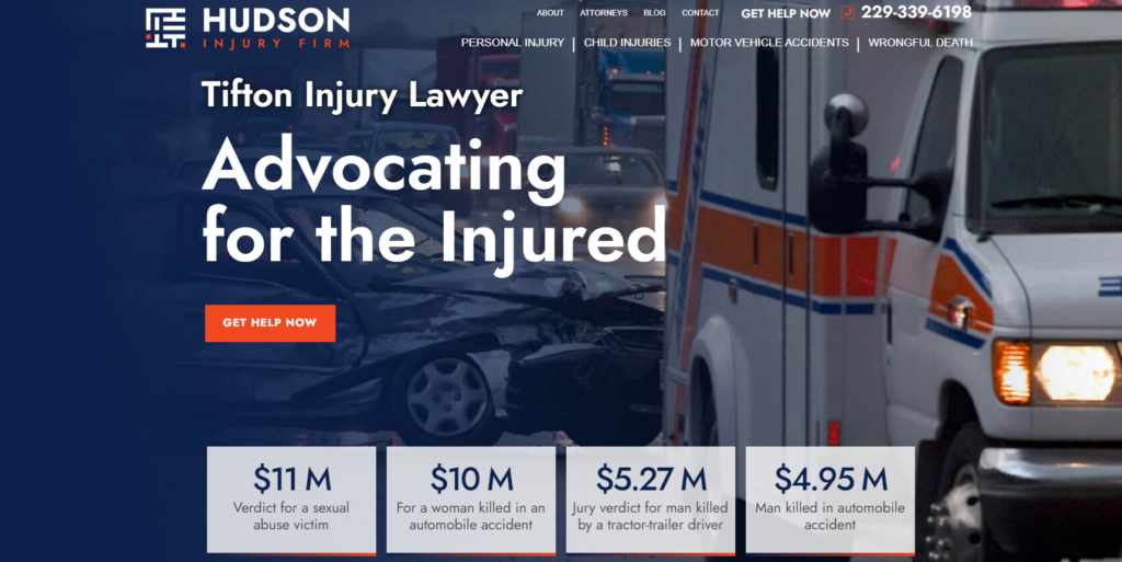
Though sometimes an ambulance in your featured image may be a little on the nose, here it works with the orange and blue color scheme well. Again we have the dollar signs that help give potential PI clients confidence and we have a simple menu with a detailed homepage that also features an interactive FAQ section.
12. Nicolet Law Firm
Why We Like It
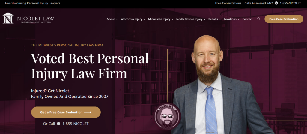
Though this site is a little on the busy side, it’s the branding that makes this site shine. The drawing of the firm’s president and trial attorney Russel Nicolet is not only prominently featured on the firm’s website, but it is also a key aspect of all their marketing from billboards to TV. Winning in PI isn’t just about your website, but about your brand and how your website communicates that brand.
13. West Coast Trial Lawyers
Why We Like It
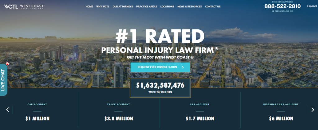
This is another site that catches attention with big win numbers right at the top, and a strong link to request that free consultation. The site also features a lot of interactivity right on its homepage which unfortunately leads to this site’s one major flaw and the reason why it is not ranked higher, the speed of the site leaves a lot to be desired.
14. Wegmann Law Firm
Why We Like It
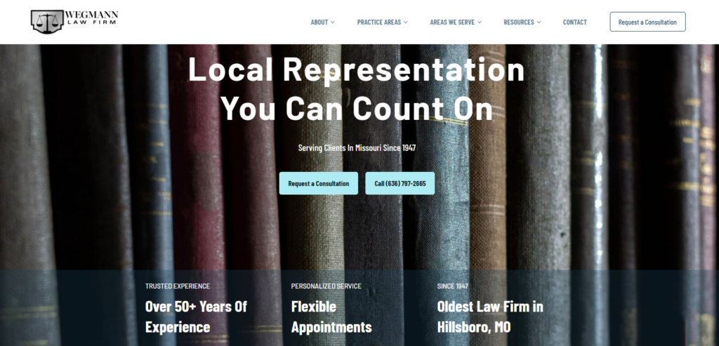
The Wegmann Law site features a unique selection of branding colors in two different shades of blue. The design speaks to the 50+ years of experience present at the firm and even calls them out as the oldest law firm in the area. Again, we have a very fast site with an active blog that is rapidly gaining traction since the launch of this relatively new site.
15. Maggs Law Offices
Why We Like It
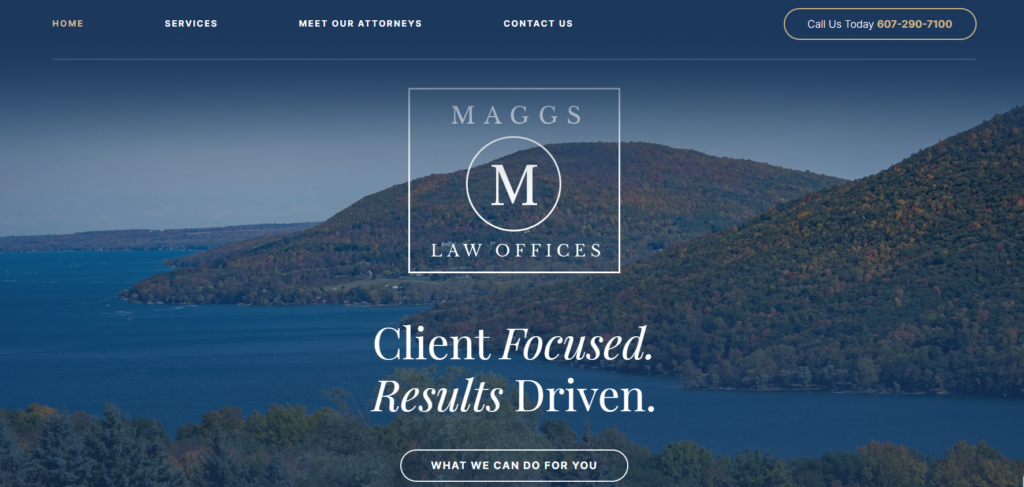
This site is simple with a focus on a beautiful countryside that will perhaps speak to the locals and a simple but not overlay simple logo. The site does have some image quality issues throughout but is overall very clean and inviting.
16. Ansbacher Law
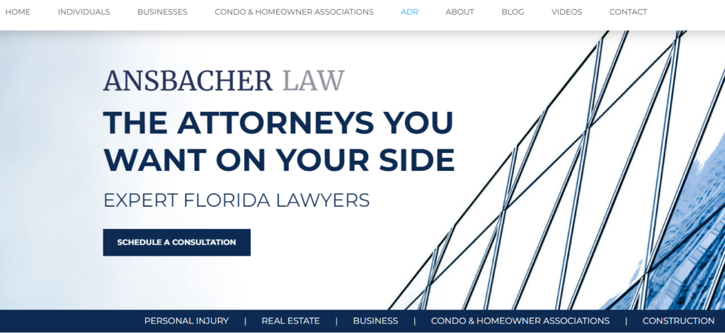
Why We Like It
We like the way that the menu breaks down with a top menu and a bottom menu that has different focuses. The design around those elements could be improved, but overall it’s a great idea without making the site overly complicated.
17. The Gumprecht Law Firm
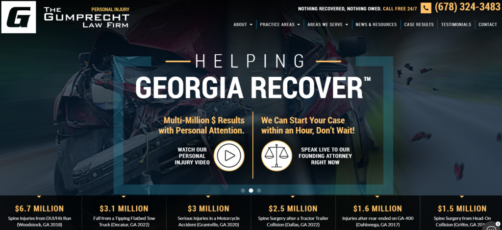
Why We Like It
The Gumprecht Law Firm site packs a lot of info into a small amount of space without making it feel too cluttered. It is interactive, has eye-catching settlement wins, and a quick interactive link to a video. With that said, the site does suffer from some serious speed issues as well as some optimization issues on the backend.
18. Gray Injury Law
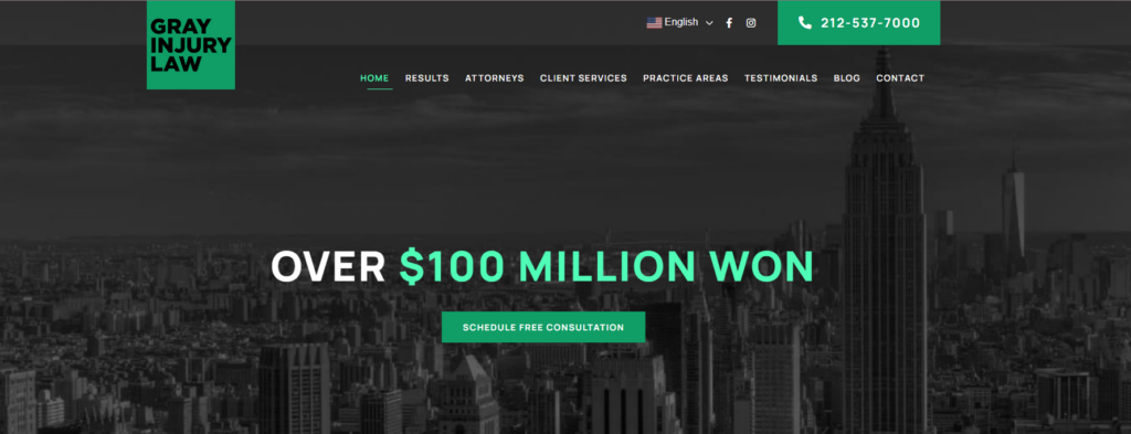
Why We Like It
This is another simple site but it again uses color to a strong effect to draw attention to the wins and the free consultation link. The site also utilizes effective animated graphics with a good mix of both color and black-and-white imagery.
19. Gunter Firm
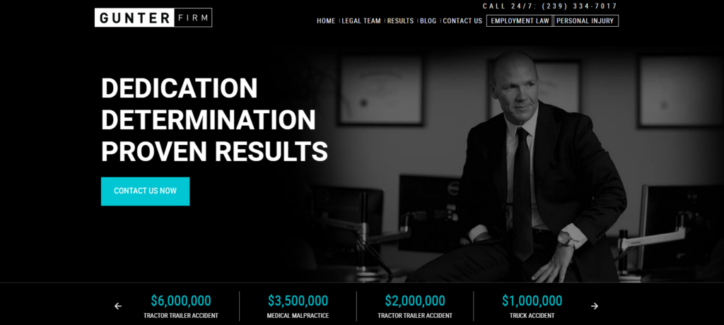
Why We Like It
Here is another simple website design with a black and white scheme that adds a splash of color with turquoise to draw attention to a CTA and to their win dollar amounts there is also a nice use of boxes in the menu to draw attention to their two practices areas, one of which is personal injury of course.
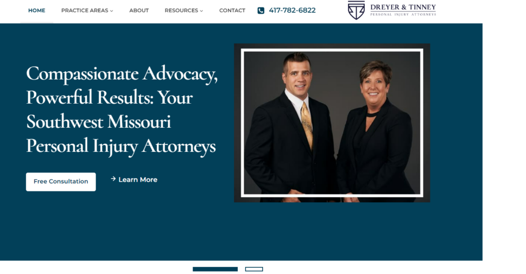
20. Dreyer & Tinney
Why We Like It
This site is simple on the surface, but under the hood, it is built for speed with an almost perfect mobile page speed score and the search engine optimization is doing a lot of heavy lifting too. They are even building out an active blog.
How to Get More Personal Injury Leads for Your Law Firm
Our Best Personal Injury Law Firm Websites List
Do you agree with our list of the best personal injury law firm websites? Did we miss any that you feel should be included? Let us know at info@getciville.com or contact us here.
