Your law firm’s website is often the first point of contact for potential clients. Problems with your website will make people leave and return to their search. Having a site for your firm that doesn’t look professional or doesn’t speak to your p[racitce area will result in fewer clients. What’s worse website mistakes can make it so your site isn’t found at all.
Common Website Mistakes Lawyers Make (and How to Fix Them)
In today’s digital age, having a strong website is key to finding new clients and building a successful practice. At Civille, we know how to make a law firm website and we know how to make them better. Let’s look at the common mistakes you will want to avoid and help you learn how to fix them.
1. Being Too Focused on Design Over Clarity
The Problem: Flashy animations, complex layouts, and oversized graphics can distract visitors and slow down your site. Potential clients might become overwhelmed and find it difficult to navigate.
How to Fix It: Prioritize simplicity and user-friendliness. Opt for a clean, professional design that puts your most important information front and center. Ensure your navigation is straightforward and your site loads quickly on all devices.
2. Not Optimizing for Your Audience
The Problem: If your website content and tone don’t align with your target client, you’ll have trouble connecting with the people you want to reach.
How to Fix It: Get clear on who your ideal client is. Adapt your website content to use language and address pain points that will speak directly to them. If you are a local form serving local clients, especially in a smaller area, ensure that your website speaks to that and makes attempts to connect with your audience.

3. Not Optimizing for Mobile
The Problem: If your website doesn’t look right on smartphones and tablets, you’re missing out on a large potential clientele. Frustrated mobile users will click away if your site’s not formatted for their screen.
How to Fix It: Make sure your website utilizes responsive design. This means it automatically adjusts to fit any screen size. Try it out on your phone, and try more than just the homepage. Unfortunately, if your site is bad for mobile currently, it’s typically going to be something your website provider will have to fix for you if they are capable.
4. Slow Page Speed
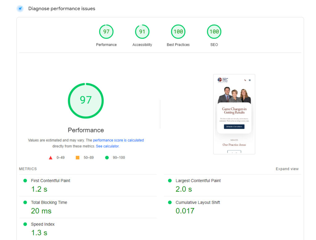
The Problem: Slow-loading websites frustrate potential clients. People are impatient online, and won’t wait around for information. As websites get flashier and people transition to spending most of their online time on their phones, the battle for page speed will only increase. Nto only will users navigate away, but page speed is a major ranking factor for Google. If your site is slow it may not even show up in search results.
How to Fix It: Optimize your site for speed, paying attention to image file sizes, minimizing plugins, and potentially using a caching tool. Unfortunately, this is another spot where you could run into platform constraints with your current website provider.

5. Using Jargon and Legalese
The Problem: Potential clients without legal expertise may not understand complex terminology. Overly technical language creates a barrier and can erode trust.
How to Fix It: Break down legal concepts into plain English that a layperson can understand. Use clear, concise language while still showcasing your expertise. Consider having a glossary for commonly used legal terms on your site.
6. Ignoring Ongoing Updates
The Problem: Outdated content can reflect poorly on your firm, and search engines favor sites with fresh updates.
How to Fix It: Make a plan to keep your website regularly refreshed. This could be adding new blog content frequently or attorney bios with new information, awards, etc. If laws change regarding your practice areas, get some long-tail keyword blogs out on the matter and ensure that your practice area pages reflect those changes.
7. Too Little Content
The Problem: A website without enough content won’t give potential clients enough information to make informed decisions. Additionally, thin content hurts your chances of showing up well in search results.
How to Fix It: Add robust, informative content to your site. This could include practice area summaries, answers to frequent client questions (FAQs), and routinely updated blog posts on relevant legal topics. Don’t ignore things like attorney bios either. Especially with small firms, people want to know who they are dealing with.

8. Burying Your Contact Information
The Problem: Clients often need help quickly. If they struggle to find your contact details, they’ll likely find another firm that’s easier to reach.
How to Fix It: Display your phone number, email, and physical address prominently on every page. Consider using a contact form on your homepage as well, making it easier for visitors to reach out immediately.
9. Lack of Promotion
The Problem: A beautiful website does little good if no one knows it exists. You need to actively promote it.
How to Fix It: Create a plan for promotion. This could involve regular social media activity, working to obtain links from reputable websites to your own, and using relevant online directories. You hopefully have a great website. Now make sure it gets seen.
10. Not Having a Clear Call to Action
The Problem: If visitors aren’t sure what action to take or what your firm actually does, they’re likely to leave.
How to Fix It: Determine your primary goals for your website including the types of clients you want and what you want them to do when they get to your site. If you are looking for calls, form fills, or even chats, then ensure that those are front and center while still being implemented cleanly into your design. Guide your visitors towards those desired actions.
Read More: Attract More Clients—10 SEO Strategies for Law Firms
How Can Civille Help?
Civille understands the unique challenges faced by law firms. Let us help you avoid these mistakes and create a website that converts visitors into clients. Here’s what we offer:
- Clean, User-Friendly Designs—We create sites that strike a balance between attractive aesthetics and intuitive functionality.
- Client-Centric Content—We help you craft content that explains complex legal concepts in a way your clients will understand.
- Strategic Calls to Action—We’ll work with you to incorporate clear prompts and forms that drive the actions you desire from visitors.
- Ongoing Support—We’re your partners! We provide ongoing support and guidance to keep your site up-to-date and effective.
- Mobile Responsiveness—We prioritize mobile-friendly design ensuring your law firm’s website looks great and loads fast on every screen, device, and Internet connection.
Why is Page Speed Important for Law Firm Websites?
Most Law Firm Websites Are Limited by Their Platform
Unfortunately, most law firm websites are going to be limited in terms of design, mobile friendliness, and page speed by their platform. At Civille, we use WordPress as a backend because it is the most adaptable and ubiquitous content management system available, but we have built in our own proprietary technology to ensure that our sites are lightning-fast and can meet any design need or request.
Ready to Upgrade Your Law Firm’s Website?
Don’t let an outdated or confusing website hold your practice back. Contact Civille today for a free consultation and let us help create a website that truly represents your firm and attracts your ideal clients.


