At Civille, we do law firm websites. Specifically, industry-best fast and modern law firm websites.
While we’d love to do everyone’s site, we understand that is not possible. But, that doesn’t mean we don’t want the industry to do better – even if it means attorneys building their sites (or going with a competitor).
There are many things a website can do to help out a law firm. We’ve written about these on our blog through the years. But when it comes down to brass tax, there are a few non-negotiable items. We’ve compiled the top 5 must-haves for law firms below.
The 5 Things Every Law Firm Website Needs
Click-to-Call

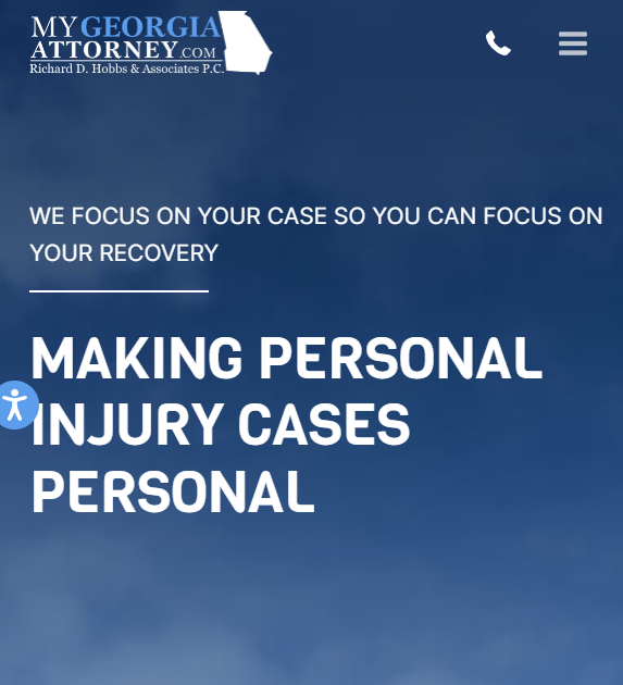
This is the top-of-the-list no-brainer for anyone that has a law firm website. When clients need a lawyer, they often need one NOW. And while the immediacy of the need is different depending on the practice area, you still need them to be able to contact your firm easily.
Having a phone number at the top of the website that is easy to see and access is essential. And it’s extremely important on mobile. Around 70% of all
website traffic comes from mobile, depending on your area. A potential client finding your site needs to be able to click the button, generating an immediate call to you.
As a bonus, the phone number on the top of the page should travel with the user as they scroll, giving them the easiest opportunity to convert at any point. A bonus is call tracking and attribution, so you understand how many calls you are getting, and the sources they are coming from so you can make adjustments to your overall website and marketing using your call data.
Easy Forms
Next to phone calls, forms are the next most important aspect of your website in terms of converting clients. A chat tool can be lumped into this as well – it was only left out because we are limiting the list to five.
A well-placed contact button and easy-to-fill-out form will help you convert more website visitors into leads.
And you don’t have to settle for a basic form. The website form can gather whatever information you want it to if you have the skills to create it. For instance, you can gather information on whether the individual is a new or returning client. Or, you can even ask qualifying questions that weed some less optimal customers out – saving your firm time and money.
In this way, your forms can both encourage and discourage website visitors. It all depends on whether you want the website to qualify leads – or if you want to make it super simple to convert and figure out lead potential later. Our Civille Law Forms allow for that customization.
Detailed Content
There’s nothing more frustrating for many potential clients than searching for a good attorney and finding a site that says nothing about the firm. From the homepage to the practice area pages, your site should include helpful content that lets a user know what you specialize in and why they should go with you.
You need to cater the content to users in several different stages of conversion. Some may want to call you immediately if you can help them. You want your practice areas listed on the homepage so you can give these users immediate confirmation that you can assist with their cases.
For others, they want to get to know the firm before even contacting you. This user will require detail beyond the homepage, with information on the firm on the About section and informational pages on each attorney and what they specialize in. This is a time to gloat about cases won, awards were given, and more. If someone is shopping around, you need to let them know you have the experience to get them what they need.

Adding regular blog content to your site is a great way to continue to move your site up the search results pages, and provide more detailed information for users that are finding you through search and combing your website.
Design with Good UX
You can have the best-written content in the world, but if your design and user experience don’t allow someone to successfully navigate your site, you’re sunk.
First off, your design needs to be professional and speak to your service area. If you are an elder law attorney, take a softer approach to the imagery, colors, fonts, and overall feel. If you are a large business litigation firm, you want a more rigid, large-firm look that proves you mean business.
In any event, your design and user experience needs to allow an individual to flow to their desired section of the site easily. This is where the other elements like click-to-call and custom forms come into play. They must be laid out appropriately within the site design on mobile, desktop, and tablet.
Tracking the success of your site through Google Analytics and Google Search Console can help provide insights as to where you might be lacking – and how you can improve. Are customers dropping off quickly or not getting to your site at all? You might have slow load times, which is a huge negative factor for Google. That part of the UX speaks to your code base and entire platform. It’s not easy having a fast site, and it can be the difference between showing up first or not appearing in search results. Google’s Pagespeed Insights tool will tell you where you stack up.
If we had more room in this post, we’d talk about the importance of a fast site that starts with your platform. But, it’s getting lumped into this point. Again, keeping it at five.
ADA Compliance Tool
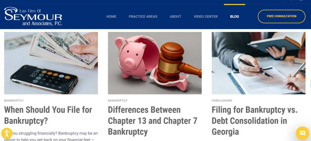
The Americans with Disabilities Act changed the game for many site providers a few years back. All over the country, site owners were being hit with lawsuits because their site couldn’t easily be accessed by someone with a disability.
While attorneys might have the least exposure here due to their profession, it’s still important to be compliant. And actually, there is no such thing as a completely ADA-compliant website, as the true definition doesn’t exist. This makes it all but impossible for site builders to make their sites completely accessible to those with impairments.
Your best bet is to have one of the high-quality ADA compliance tools on your site at all times to avoid any issues.
And even if the risk of a lawsuit may be less for lawyers, you don’t want to be a law firm that isn’t ADA compliant. Imagine a lawyer that works in social security disability not having a site that people with disabilities can easily use. Not a good look.
As stated above, there are many things that a law firm can do with a website to help their business. But to have the bare minimum of a website, you need to consider these factors.
If you have questions about how to do any of this or want to check out the Civille platform, don’t hesitate to reach out to us.


